A Good Story Is Worth More Than Anything
Today, I had a chat with my tennis mate after we'd spent over an hour sweating it out on the court. Even though the sky was overcast and the sunlight muted, the heat was relentless — we were dripping with sweat even before we stepped onto the court. It was the kind of heavy, oppressive heat that comes from the indecisive temperament of Bangkok's summer rainclouds.
We talked while nibbling on chocolate Cornettos to cool off — a sight that, from afar, might have looked like two innocent kids enjoying their favorite ice cream.
But in reality, that wasn’t quite the case. Sure, we both have a playful, childlike side — something our friends at the club often point out — but behind that youthful energy is a shared creative spirit.
What makes us similar is that we both work in the creative field, though in different areas. Jo has been in advertising since before he even graduated university, and now runs his own event production company called “Kit Hai Khrop” — which loosely translates to “Think It Through.” The name itself is a testament to his talent for wordplay and his deep love for creative thinking.
We hadn’t seen each other in quite some time. Jo had been traveling frequently to Phuket to oversee progress on the upcoming Biennale event there, while I’d been up in the Isaan Gateway region, working in Khao Yai for most of the month. So neither of us had been on the tennis court much lately. After we’d finished our match, we took the chance to catch up on work — as old friends do.
Jo’s update was short and sweet — he’d already done most of the prep, and now it was just about managing production and installation to ensure everything met spec and deadlines. That gave me the chance to bring up a topic I’d been eager to discuss: the branding project for a restaurant I’m currently working on — my first time tackling branding in the food industry.
It’s not that I’m new to branding altogether. But this is the first time I’ve handled it so comprehensively. My previous experience was mainly in branding for publishing, which is where I feel most at home, having spent my entire career in that world. Back when I worked at a publishing house in the Prachachuen area, I was the one who proposed updating their logo — transforming the old cartoonish mark into a more relaxed, hand-drawn script. It felt fresher and more in tune with the newer book categories they were expanding into. I also pushed for pastel-toned book covers to soften the brand’s traditionally serious image and brought in external designers to add variety and modernity.
One of the most exciting and talked-about projects from that time was launching a new imprint aimed at children and young readers. We published "edutainment" books that made complex subjects easy to understand — blending storytelling with fun illustrations and approachable writing.
Later on, perhaps because of that track record — or maybe just because I’m a good talker — Gypsy Publishing entrusted me with shaping their editorial direction and brand image. That was a fun ride. Sharif Ganooey, the publisher, was deeply involved and incredibly open-minded. Whatever I proposed, he’d say yes. No hesitation. Budget? Approved. Scope? Go for it. Faced with that kind of freedom and trust, I gave everything I had. I poured in every bit of experience I’d accumulated.
I spent quite a bit of time studying the Gypsy brand. The first thing I proposed was bold — “change the logo” and “change the way the publishing house’s name is spelled.” I honestly don’t know where I found the courage to suggest something that big. Looking back, I was lucky that Sharif didn’t kick me out of the office on the spot. After all, here I was, some outsider telling him that the brand he had spent over a decade building needed to change — even its name. And as if that wasn’t enough, I was suggesting scrapping the logo that fans had long come to recognize and love.
But I simply said:
“If we don’t change it, we can’t move forward.”
At that point, Gypsy’s brand was in decline — losing both credibility and sales. Sharif openly admitted that the problem was his own doing: he had delegated too much to his staff without proper oversight. He had focused solely on sales, and while sales were strong, he was content — until he later realized that much of that success was built on poorly vetted manuscripts. Once discerning readers began to criticize the content, the brand took a hit. It was like a seemingly healthy person going in for a routine check-up, only to be diagnosed with terminal cancer.
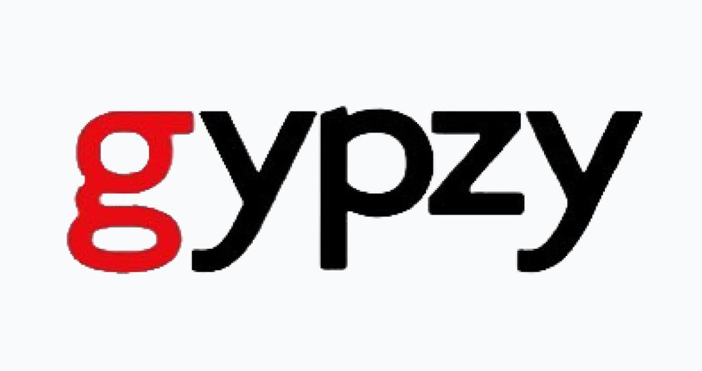
Yes… I changed the English spelling of Gypsy to Gypzy — to give it a more stylish edge and to make it more logo-friendly. I also redesigned the entire logo. The old one was a jumble of interlacing letters in a classic style. I replaced it with a sleek Helvetica font — clean, confident, and more trustworthy. I added just one bold detail: the letter Z in red.
Everyone in the meeting approved it without hesitation, and that new name and logo stayed with Gypzy Publishing for a long while afterward.
The next step I proposed was this:
“We need to acquire the rights to world-class books.”
To reinforce the identity of Gypzy as a publisher that presents global history in a fun, engaging, and non-academic way.
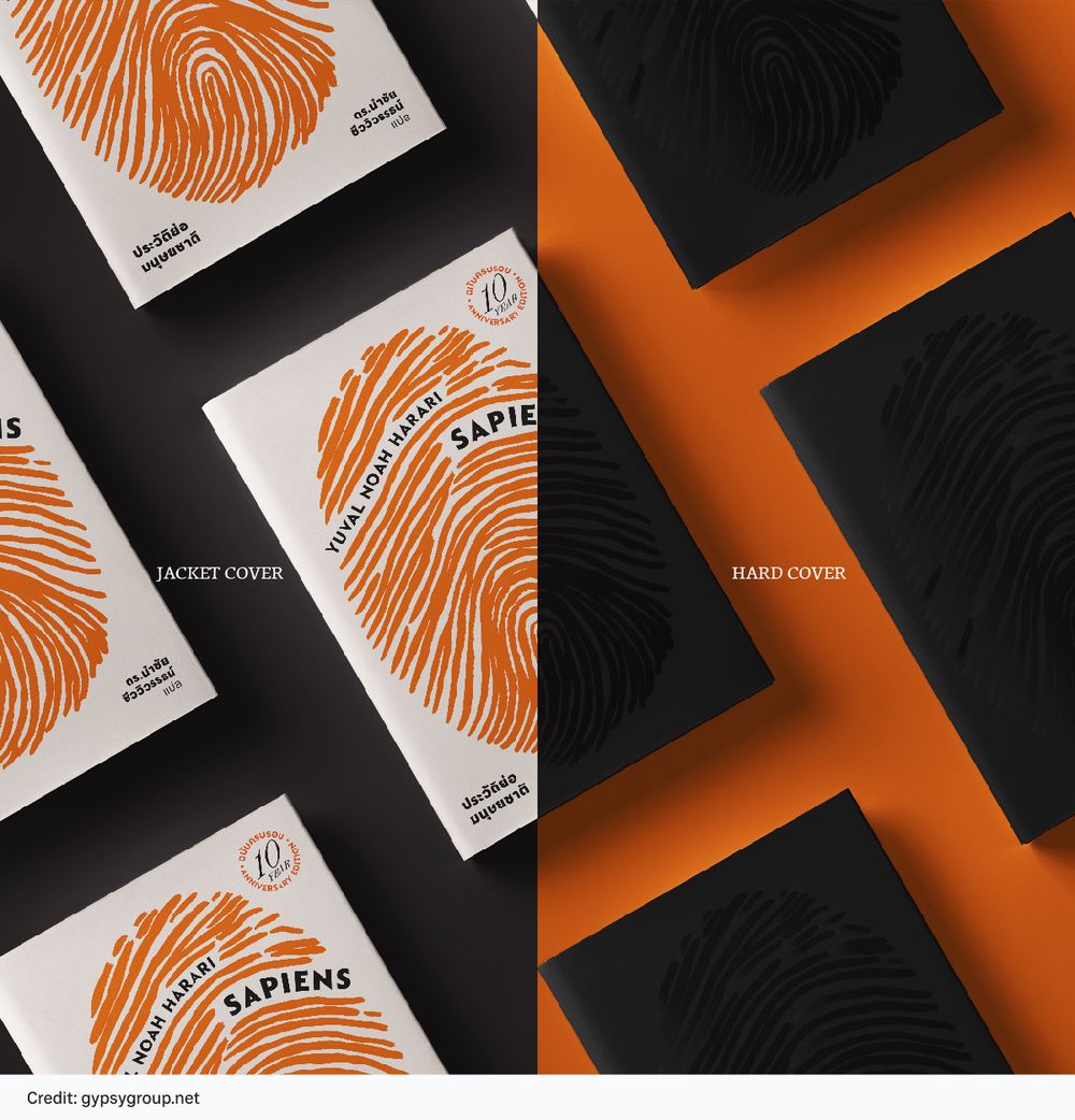
We had plenty of options. Our editorial consultants combed through Amazon listings like treasure hunters sifting through sand. Eventually, Gypzy landed the rights to Sapiens by Yuval Noah Harari — and that became a pivotal moment in the publishing house’s journey.
Another idea I proposed was developing a communication channel. That’s how the Gypzy World website and Facebook page came to be — a platform to emphasize our deep, serious interest in global history, to build a community, and to eventually create original content under our own editorial vision. This initiative became a hit in its own right. Not long after we launched the site, we had attracted a surprisingly loyal and vibrant community of young readers.
In those early days, I handled everything myself — designing the artwork, writing and posting content daily on the website. It was a fun and fulfilling experience, one I look back on with pride.
The final piece I helped transform for Gypzy was the book cover design.
I reached out to Jo — Watchira Ruthorakanok, the founder of RabbitHood Studio in Chiang Mai — and invited him to join forces with Gypzy. After just one meeting, Sharif immediately agreed to work with Jo. Their collaboration even expanded to include developing a complete Corporate Identity (CI) for the brand.
Okay… I’ve gone way off track.
The point is: this isn’t my first time doing a rebranding project. The only difference now is I’m jumping from books to restaurants. The content might differ, but the process, I believed, shouldn’t be too far off.
Or so I thought.
I might have been wrong.
Because after Jo listened carefully to what I’d done, who I was working with, where the restaurant was located, and what the branding goals were, he fell quiet for a while. Then he gave me a gentle smile, thought for a moment, and shared this story with me. (Jo mentioned that he had heard it secondhand as well.)
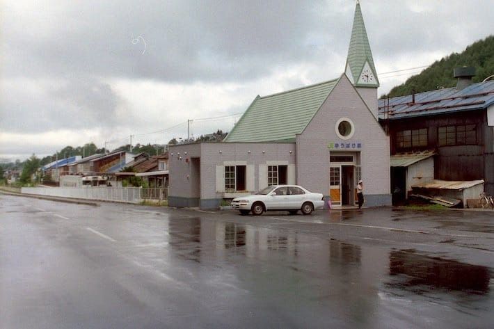
Jo told me about a town in Japan called Yubari, located on the island of Hokkaido. It was once a prosperous mining town, rich in coal reserves. The economy boomed, and the town was quite affluent. But, as is often the case, when the natural resources were completely depleted — consumed and burned away — the local economy collapsed. What was once a thriving town became poor and desolate. People packed up and left in search of better opportunities elsewhere. Only about ten thousand residents remained.
At the time, no one believed that this collapsed town could ever be revived.
But marketing and relentless creativity worked a kind of miracle — by turning inward and asking: what do we still have, and what can we use to heal these deep wounds?
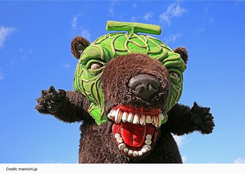
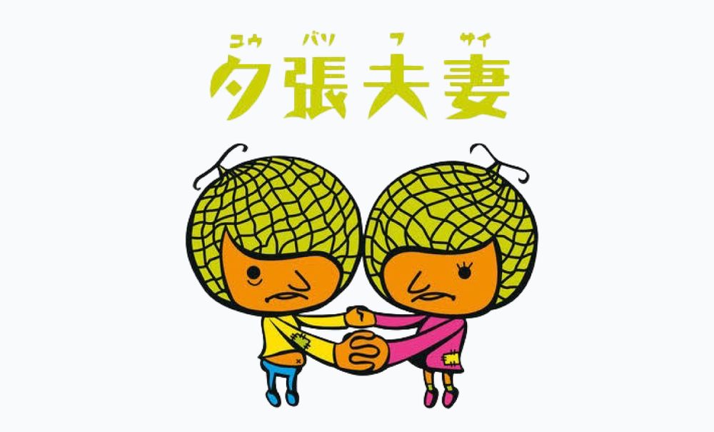
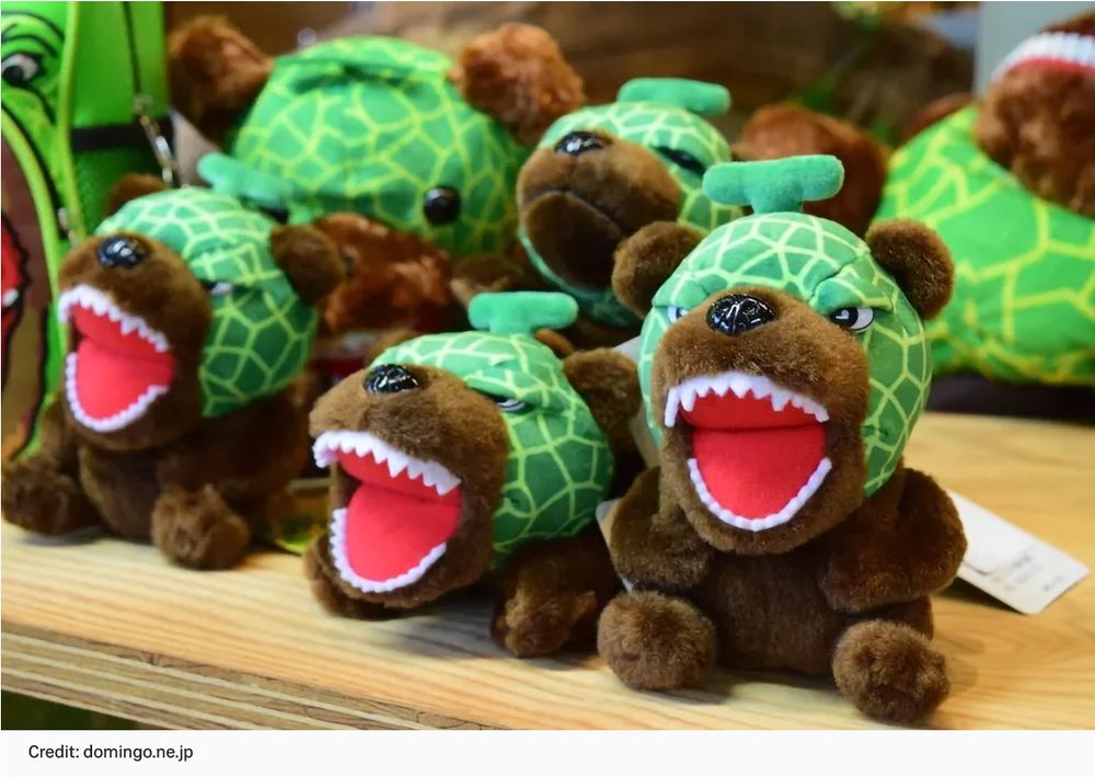
City officials identified just two remaining assets that Yubari still had going for it. The first was melon — the town had long been known for its melons, even having a melon-headed mascot. Originally, the mascot looked rather stern and unapproachable, but the team gave it a makeover, softening its features and personality to be more endearing and relatable.
The second asset? Yubari had the lowest divorce rate in Japan. Whether it was due to the small population or some other reason, no one could say for sure — but the city leaned into this fact and made it a promotional hook. If it were a Korean drama, the campaign might’ve been called something like “Poor, but Still in Love” (laughs).
And guess what?
It worked.
People started paying attention. Tourism made a comeback — especially among couples. Many traveled to Yubari to register their marriage, believing that their love would endure, just like the residents of Yubari. It wasn’t so different from the Thai tradition of registering marriages in places with auspicious-sounding names, like Bang Rak (“District of Love”) or Bang Sue (“District of Faithfulness”), rather than somewhere like Bang Chak or Bang Phlat.
From then on, Yubari fully embraced these two core ideas in promoting the town. The Yubari melon became globally renowned — and still enjoys widespread popularity in Thailand today. As for the belief in lasting love tied to marriage registrations in Yubari, it expanded far beyond Japan. People from all over the world now come here to date, propose, or tie the knot — and they haven’t stopped.
In later years, Yubari even expanded its success by launching an annual film festival — adding yet another layer of charm and culture to the town’s revival.
As Jo finished the story, we both crunched down on the last crispy tip of our Cornetto cones, silently chewing as the message of the story sank in. What came to my mind was, first and foremost, storytelling. And then — creativity. The power of taking well-researched facts and re-framing them into something compelling.
That’s how Yubari found its new mine — not of coal, but of narratives.
A natural resource that never runs out, endlessly renewable through imagination and meaning.
A Good Story Is Worth More Than Anything
I was about to ask another question, but Jo beat me to it.
He said I should think it through myself — take a deep dive into the stories I’d heard from the restaurant owner, flip them over, examine them closely, find the angle that truly resonates, and use it wisely. “If you shape it well,” he said, “it’ll be a hit for sure.”
With that, he grabbed his towel and headed up to shower on the second floor of the sports club.
I sat there in a daze. Jo’s sudden appearance today felt like something out of a folktale — a spirit of the forest emerging to help a hapless woodcutter find the axe he’d lost in the river. He had called me at 9 AM, invited me to play tennis at 9:30, played a full match, told me a story that felt like a parable — and then disappeared, leaving me staring off, unsure whether to choose the golden axe or stick with my old, chipped one.
Maybe I won’t choose just yet, I thought to myself.
Then I picked up the hotel towel and headed for the shower next to the tennis court. I liked this spot better — no hot water. Whether you turned the left or right tap, the water came out refreshingly cold. It didn’t take long before I was feeling fresh and ready to head off to a meeting with the food stylist I’d invited to help with the restaurant rebranding.
As I drove through the blazing midday sun that had suddenly pierced through the overcast sky — Bangkok’s weather, always full of surprises — I found myself pondering which axe I should choose from Jo the forest spirit.
What do you think, dear reader?
Which one would you choose?
© 2025 Khaoyai Connect. All rights reserved.
No part of this content may be copied, modified, or distributed in any form without prior written permission.
